Building enterprise credibility for Kansas City's leading vehicle shipping SaaS platform -- without losing the startup energy that drives their team.
Super Dispatch connects vehicle shipping carriers and shippers across the US. As they scaled from startup to enterprise platform, their visual identity stayed stuck at day one -- scrappy where it needed to be authoritative, inconsistent where it needed to be systematic.
Marketing, product UI, and sales materials were speaking three different visual languages. A carrier looking at a sales deck and then logging into the product felt the disconnect. That friction costs deals.
We started by auditing every touchpoint -- the product interface, sales collateral, social channels, and physical space -- before touching a single logo or color. What we found was a brand with strong bones and no system holding them together.
The solution was not a rebrand. It was a brand system -- shared rules for typography, color application, photography, and layout that could scale from a social post to a product onboarding screen without breaking.
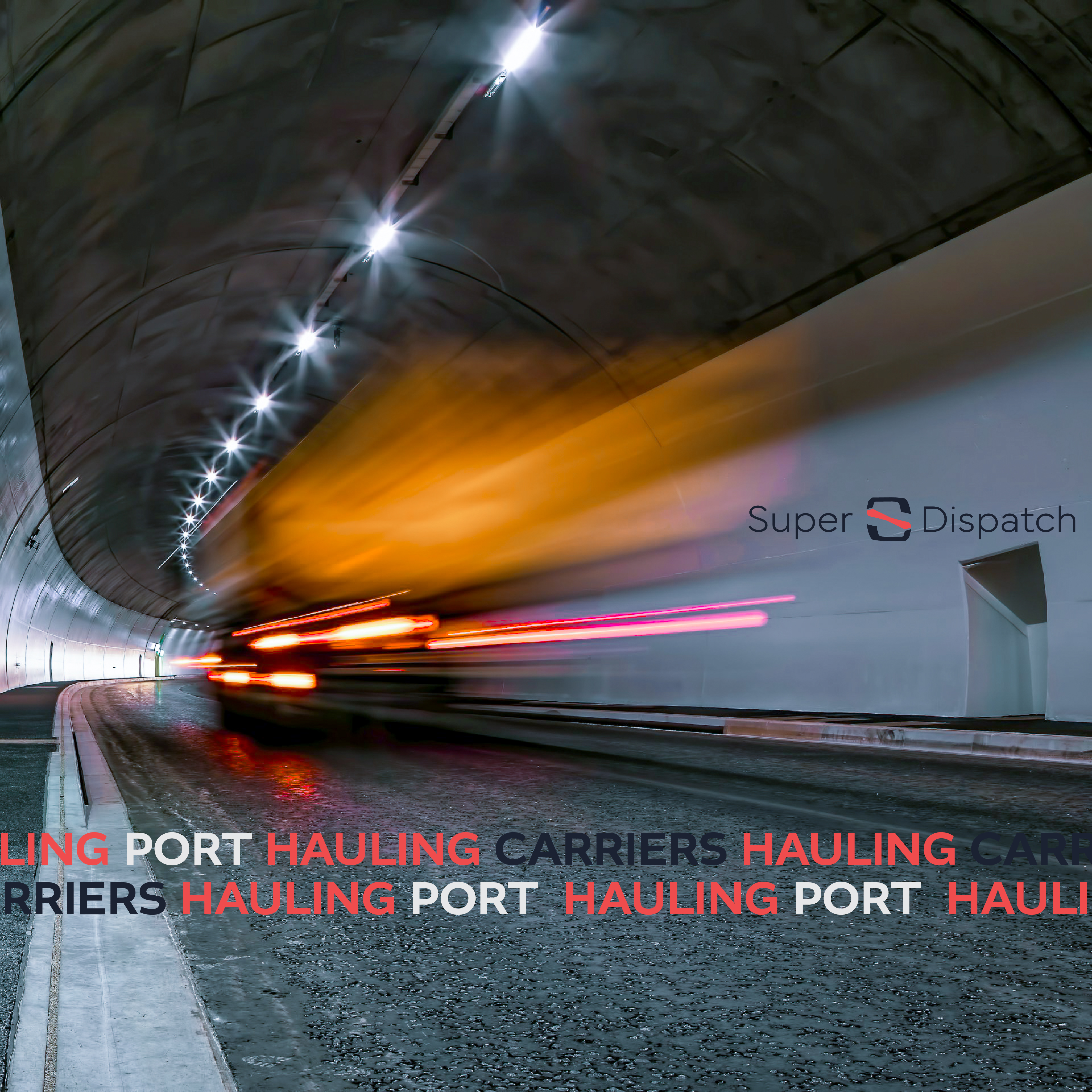
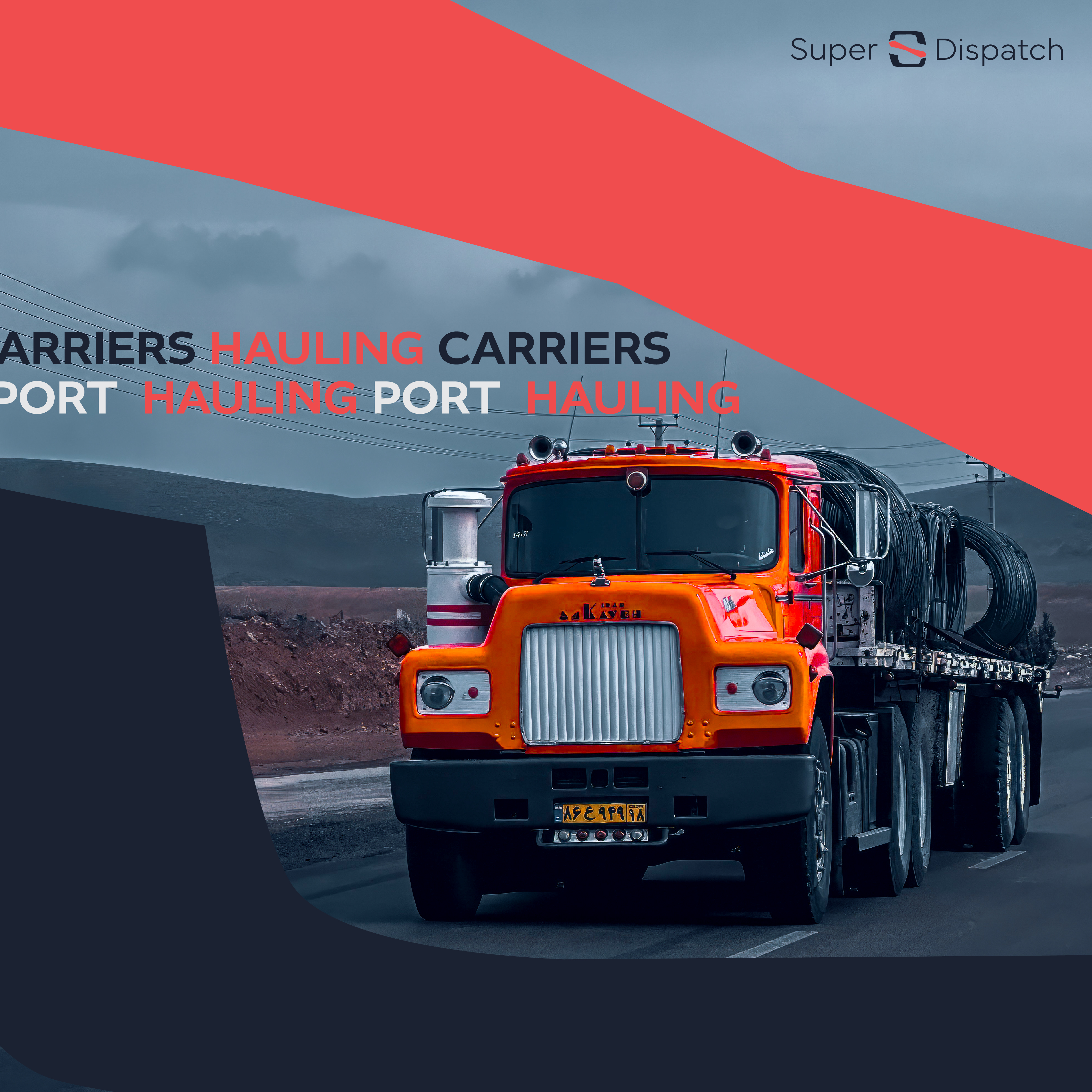
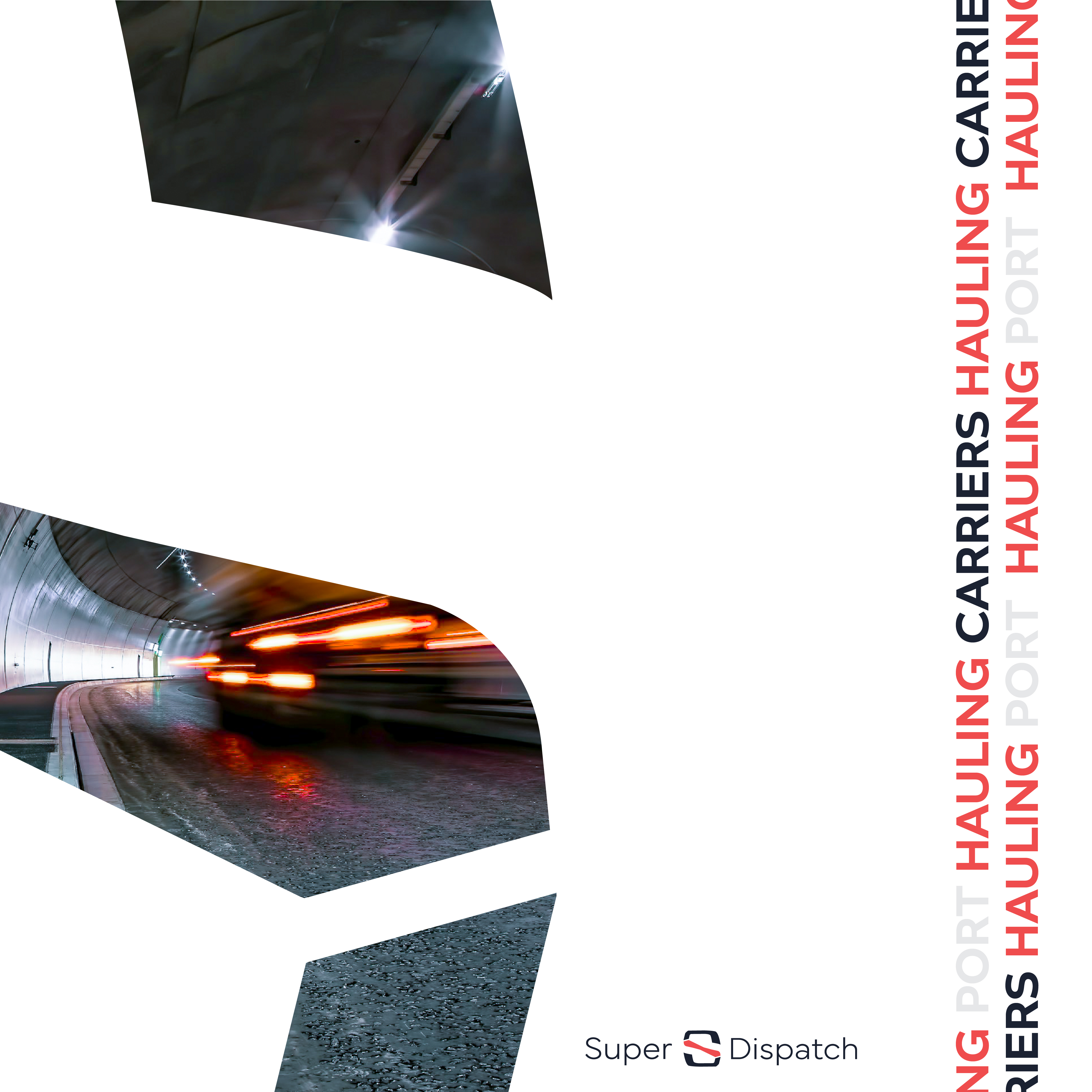
The campaign work extended the brand into motion through social content built around Super Dispatch's core world -- movement, speed, and the open road. Bold typographic lockups, kinetic imagery, and a consistent color architecture gave the brand immediate recognition across feeds.
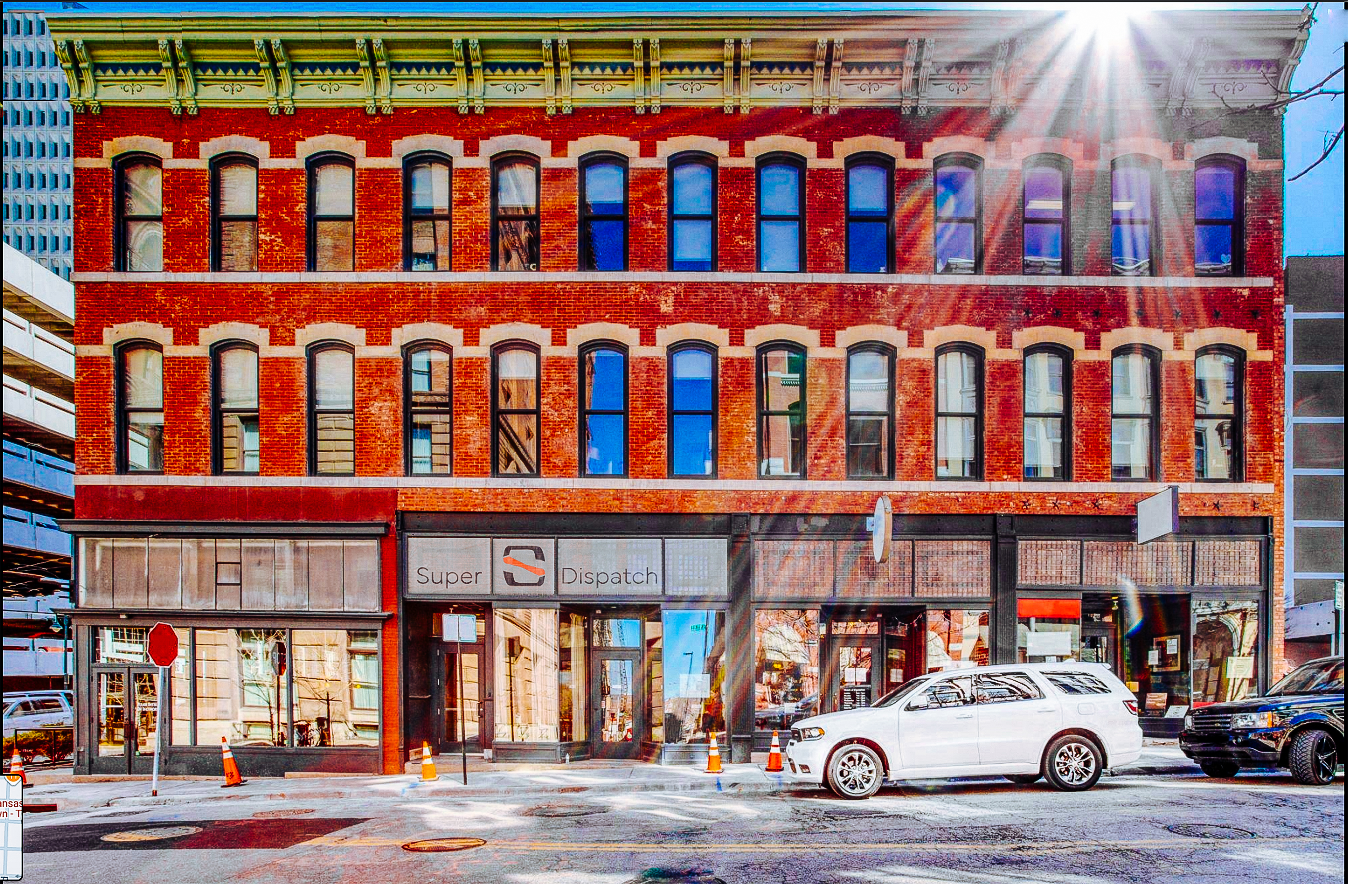
Physical signage at their Kansas City headquarters brought the brand into the built environment -- making the office itself a brand statement for carriers, investors, and team members walking through the door.
Super Dispatch now has a unified brand system that aligns product UI, sales collateral, digital marketing, and physical space under one cohesive visual language. Enterprise credibility without losing the startup energy that defines their culture. The brand grew up without selling out.